Stone, Wood and Granite Design
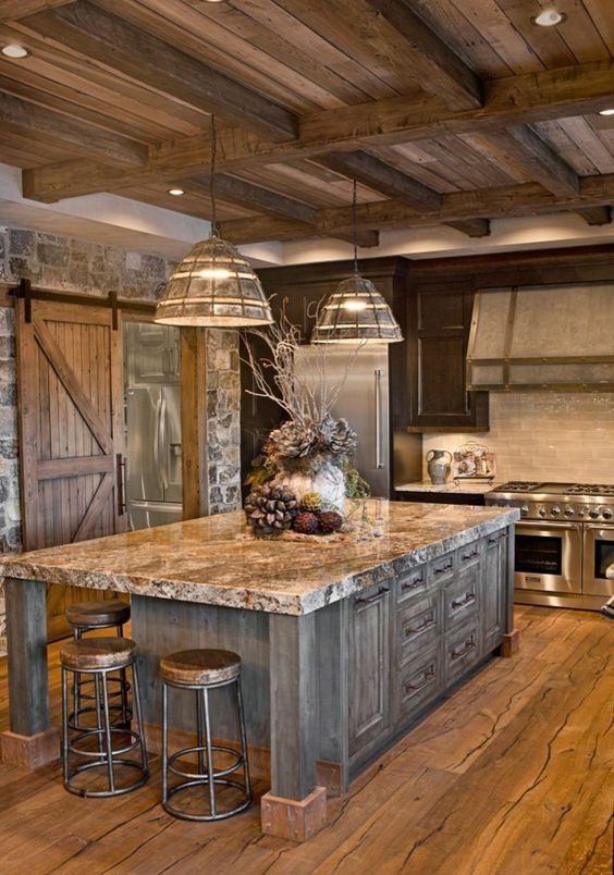
When stone, wood and granite come together its called design and can be a beautiful thing. Mixing materials can be overwhelming. Just keep it simple and be aware of busy patterns especially in natural stone. If you pick a granite with an active pattern then tone down the other patterns and keep them simple. Add a touch of texture to every room for the perfect balance, but too much can have the opposite effect and ruin a design. My favorite rule in interior design…less is more.
Carrie
XOXO
Moose Head Decor
This is one of my favorite inspirational decor pieces! I think everyone needs this moose head!

It will fit in anywhere, anytime…Hollywood glamour, a lodge, a cabin, a house, modern, contemporary, rustic, holiday, seasonal, winter, summer, year round…its just one of those pieces! If you like a little chic with your rustic… this is the moose for you!
This is going to be my new DIY project to make one of these!
Carrie
XOXO
Log Home Living
When I see a photo like this I don’t think oh look at the sofa or what a cute coffee table…. I think: wow look at all that wood and texture and how the beams form their own design all the way up to the ceiling…. and look at that natural light coming in through those amazing windows!
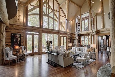
Neutral and natural is the best way to show off texture! You know you have a great design when the furniture takes the back seat to the architectural features. Furniture serves a purpose but its the architectural features that invite us in. Can’t do a lot…then just do a little!
I say let that $8,000 sofa go and spend your money on as many architectural elements that you can! A $2,000 sofa will be just as comfortable and look at the view you will gain!
Re purpose, reclaim, re salvage…
Carrie
XOXO
Flea Market Home Decor Inspiration
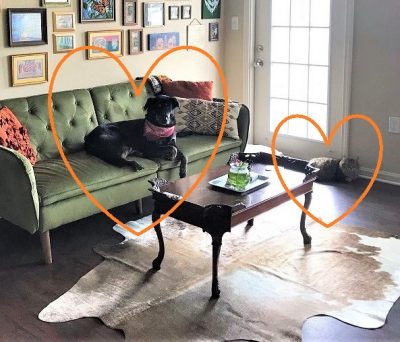
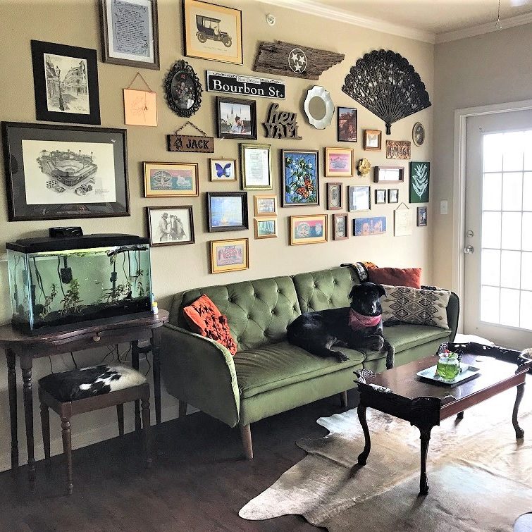
OK, so I just have to share…. My friend sent me this pic of the gallery wall she did with all of her finds, treasures, and memories! The cool vintage furniture, the accessories, the rugs,..everything. Now if that’s not some serious flea market, junking, thrift store scoring, treasure hunting inspiration I don’t know what is! That’s Mollie Mae on the sofa and Vixey on the floor, her prize possessions… they were found and rescued too!!
She is an expert thrift-er and you can follow her on Instagram, she always has fun things for sale! @thethriftydarlin
So all my DIY friends…If you want to create your own gallery wall just do it! Don’t try to lay everything out and match each side or make a template…. just start hanging! A gallery wall should be as unique as you are! Mix it up with memories, mementos and all your fabulous finds! If you only have a few items hang them up and then start searching, you will fill your wall up in no time! See you at the next flea market!

Happy Hunting!!
Carrie
XOXO
Design Tips for Small Spaces
So you’ve decided to downsize and want the same pulled together look you had in your larger space. Small spaces can have the same feel as larger spaces, you just have to make a few adjustments.
Here’s a great example: When you visit a website on your computer vs when you open the same website on your phone, you will never be able to view all the details on your phone space that you would view on a large screen computer, but you still get the same visual feel and information.
I like to think of a small space or area as a “vignette” which is a french word meaning; a short version that clearly expresses the typical characteristics of something.
When designing a small space here are a few tips:
Think simple, less is more
Keep it light
No clutter allowed
Start with your largest item first
Go for a neutral space with pops of color
Accessorize the space to coordinate
Use what you love just less of it
If you have questions or just need ideas give us a call!
Carrie
XOXO
