interior design

Stone, Wood and Granite Design
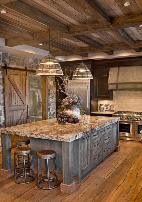
When stone, wood and granite come together its called design and can be a beautiful thing. Mixing materials can be overwhelming.  Just keep it simple and be aware of busy patterns especially in natural stone. If you pick a granite with an active pattern then tone down the other patterns and keep them simple. Add a touch of texture to every room for the perfect balance, but too much can have the opposite effect and ruin a design. My favorite rule in interior design…less is more.

Carrie

XOXO

By |2018-12-17T06:55:32-08:00December 17th, 2018|Blog, Uncategorized|0 Comments

Moose Head Decor

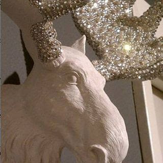
This is one of my favorite inspirational decor pieces!  I think everyone needs this moose head!

It will fit in anywhere, anytime…Hollywood glamour, a lodge, a cabin, a house, modern, contemporary, rustic, holiday, seasonal, winter, summer, year round…its just one of those pieces! If you like a little chic with your rustic… this is the moose for you!

This is going to be my new DIY project to make one of these!

Carrie

XOXO

By |2018-11-05T08:37:51-08:00November 3rd, 2018|Blog, Uncategorized|0 Comments

Log Home Living

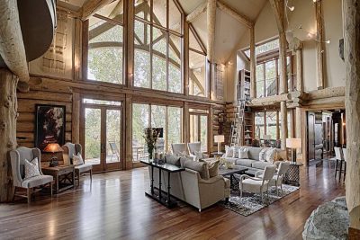
When I see a photo like this I don’t think oh look at the sofa or what a cute coffee table…. I think: wow look at all that wood and texture and how the beams form their own design all the way up to the ceiling…. and look at that natural light coming in through those amazing windows!

Neutral and natural is the best way to show off texture! You know you have a great design when the furniture takes the back seat to the architectural features. Furniture serves a purpose but its the architectural features that invite us in. Can’t do a lot…then just do a little!

I say let that $8,000 sofa go and spend your money on as many architectural elements that you can! A $2,000 sofa will be just as comfortable and look at the view you will gain!

Re purpose, reclaim, re salvage…

Carrie
XOXO

By |2018-11-03T16:50:43-07:00October 22nd, 2018|Blog|0 Comments

Flea Market Home Decor Inspiration

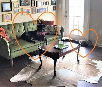
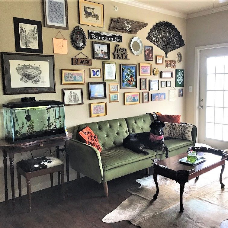
OK, so I just have to share….  My friend sent me this pic of the gallery wall she did with all of her finds, treasures, and memories! The cool vintage furniture, the accessories, the rugs,..everything. Now if that’s not some serious flea market, junking, thrift store scoring, treasure hunting inspiration I don’t know what is! That’s Mollie Mae on the sofa and Vixey on the floor, her prize possessions… they were found and rescued too!!

She is an expert thrift-er and you can follow her on Instagram, she always has fun things for sale!  @thethriftydarlin

So all my DIY friends…If you want to create your own gallery wall just do it! Don’t try to lay everything out and match each side or make a template…. just start hanging! A gallery wall should be as unique as you are! Mix it up with memories, mementos and all your fabulous finds! If you only have a few items hang them up and then start searching, you will fill your wall up in no time! See you at the next flea market!

Happy Hunting!!

Carrie
XOXO

By |2018-10-22T07:43:12-07:00October 22nd, 2018|Blog|0 Comments

The Mix and Match Design Trick to Creating Rustic Style

The new comfy, cozy rustic styles are trending but can be very confusing. Is farmhouse the new Shabby? Isn’t organic the same as rustic? What is woodsy? What is modern farmhouse? How can I add just a touch of rustic? Can I mix vintage with everything? I get these questions all the time!

Confused? I can tell you what you are probably doing wrong…..Don’t pick just one style….How boring would that be? Plus when you limit yourself and focus on just one exact style, it’s actually harder to pull off!  That’s when you usually call me in to fix it, which is great, but you can do it yourself, really! Mix it up, pick at least 2 or 3 styles you like and start in. Don’t be intimidated.  How many times have you seen a room in a magazine where you thought, “Oh, I like this but I wouldn’t have done that, or put that there”.  I know I have a million times. But someone else loves that room! That’s the best part about being unique with your own style… it is your unique style and there is no way everyone is going to love it, but you do.

I love that my style is a crazy mix of many things:  Farmhouse, rustic, reclaimed, repurposed, boho, vintage, ranch, industrial, cottage, shabby with a touch of chic and a hint of modern. The blunt version:  flea market finds, DIY projects, wood and a few modern conveniences.  I love a room that has character, is lived in, has a cozy feel and reflects who I am the moment you walk in.  Yes, I have a thing for anything distressed because it has a story, has been a little abused, and is in need of some TLC. The best part…..it’s my unique style.

Growing up we lived in every inch of our house and we didn’t have that room that was off limits except for holidays.  There were always a few scratches and dings on the furniture and an eclectic mix of furniture pieces, some bought and some inherited that were one of a kind. In full disclosure most of the scratches and dings did come from me as a child! Back then a wreath or dried flowers was considered “rustic”, and many would have things refinished so they were perfect again. However, today we pay top dollar for all that furniture with imperfections and it’s the “new rustic”. Who would have ever thought? I love all things distressed and like to rescue furniture as much as I like to rescue animals.

My advice to you, don’t get hung up on styles or names. My rustic might be your organic but we share the same style vision so who cares what it’s called…it’s your own unique style and you can mix anything and call it whatever you would like! That’s what you’re missing and that’s what you will be happy with. If you’re looking for your wow factor, what draws attention is your unique style, not the same thing everyone else has. Years ago we called it eclectic, which was the fancy word for mismatched. Maybe different chairs at a table, at a table, colors, or opposing textile styles.

Mismatched fashion is huge right now. I can grab anything out of my closet whether it matches or not and look like I spent hours pulling it all together!  That’s what you can do when you start mixing styles. Graphic designers, interior designers, fashion designers, magazines, social media posts always mix up styles and make it their own to create interest and to give you something new and interesting that you haven’t seen.

By |2018-10-08T17:03:35-07:00October 8th, 2018|Blog|0 Comments

Tips to Transition into Fall Gracefully

One more week to September and you cant wait to get out your big orange and black bins that have been stored away for a year with fun Fall and Halloween decor!  But maybe you aren’t quite ready  for pumpkins and ghosts to take over your home….here are a few tips to transition into Fall and the Holidays gracefully:

  • Use different colors than the traditional oranges and blacks, who doesn’t love a blue pumpkin!
  • Mix a few Fall items like pumpkins and Fall leaves in with other items like succulents or fresh flowers
  • Use muted or pastel versions of Fall colors
  • Use patterns for your table or pillows that are Fall-ish but can also blend with any decor such as a black or orange buffalo plaid or stripe
  • Change out candles to Fall scents
  • Put up your wood signs or decor pieces that have words like “Gather”

Keep decorating!

Carrie

XOXO

By |2018-09-09T19:01:50-07:00August 24th, 2018|Blog|0 Comments

Modern Farmhouse or Farmhouse Modern?

Yes, I am obsessed with wood beams and their beauty. I also like my modern farmhouse with a little less modern but there is a fine line with doing farmhouse style to keep it current. This brings me to my texture rule….  Too much wood and texture seems outdated. But just add a touch of modern and you can pull it off. balance to pull it off. In this case obviously the wood features take center stage and the accessories pull off the balance factor. This is the perfect style if you like a rustic feel without a lot of clutter.

Carrie

XOXO

By |2018-09-09T19:02:02-07:00August 17th, 2018|Blog|0 Comments

Design Tips for Small Spaces

So you’ve decided to downsize and want the same pulled together look you had in your larger space. Small spaces can have the same feel as larger spaces, you just have to make a few adjustments.

Here’s a great example: When you visit a website on your computer vs when you open the same website on your phone, you will never be able to view all the details on your phone space that you would view on a large screen computer, but you still get the same visual feel and information.

I like to think of a small space or area as a “vignette” which is a french word meaning; a short version that clearly expresses the typical characteristics of something.

When designing a small space here are a few tips:

Think simple, less is more
Keep it light
No clutter allowed
Start with your largest item first
Go for a neutral space with pops of color
Accessorize the space to coordinate
Use what you love just less of it

If you have questions or just need ideas give us a call!

Carrie

XOXO

By |2018-09-09T19:03:16-07:00May 13th, 2018|Blog|0 Comments
Go to Top